Key metrics
The dashboard displays five key metrics at the top:- Number of journeys: Shows the total number of active journeys in your organisation that have been executed.
- Journey sessions: Displays the total number of distinct executions that have been initiated within the journeys.
- Completed sessions: Shows how many journey sessions have reached a final decision point.
- Completion rate: Presents the percentage of journey sessions that successfully completed the verification process. This metric helps you understand overall system effectiveness and user experience.
- Average time: Shows the mean duration for journey completion in seconds.
Total journeys by delivery mode
This is a chart that shows you the split in journey sessions between preview and production over time.- Preview: Number and percentage of journeys running in preview.
- Production: Number and percentage of journeys running production.
Journey decisions
Journey decisions present a horizontal bar chart that provides insights into a journey evaluation decision. It shows you all the journeys with an evaluation decision and the most encountered decisions in percentage. For instance, you can see if Decision: Reject is the most common evaluation in your journey. Rather than showing static decision data, this interface lets you define how different verification outcomes, for example, Decision: Accept, should be grouped across time periods. This enables you to analyse evaluation decision rates and identify trends in your verification decisions. To do this, navigate to the list of dropdowns on any of the decisions and select any of the available evaluation options.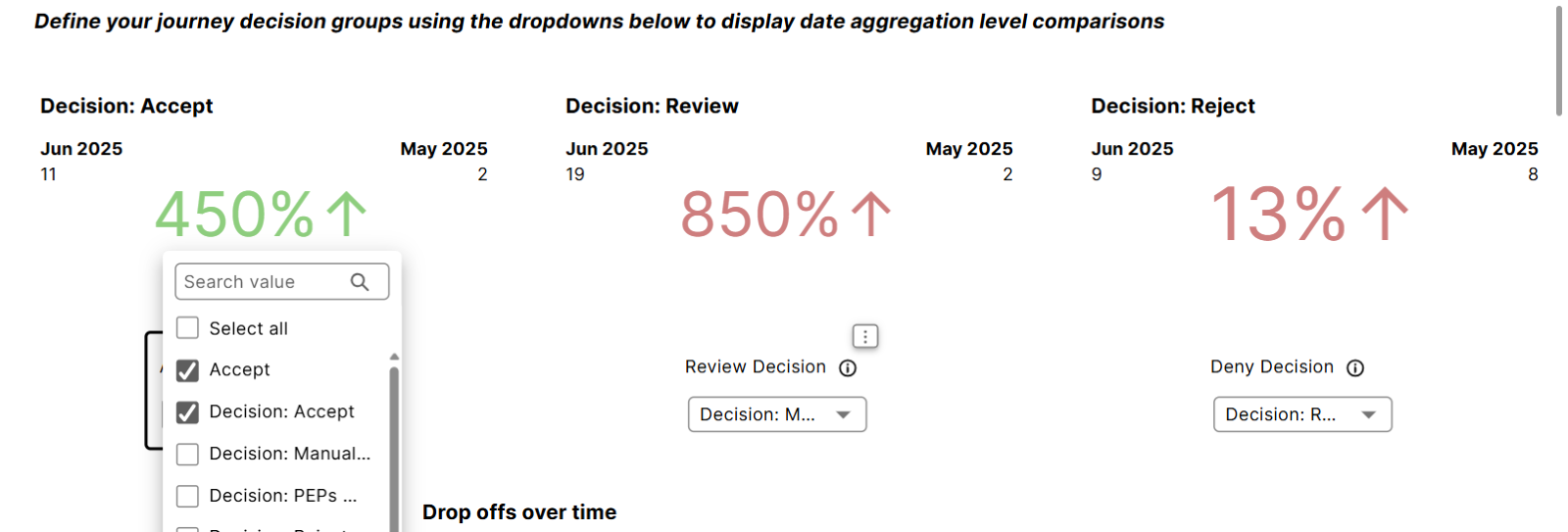
- Accept
- Decision: Accept
- Any other acceptance evaluation/criteria you’ve defined on your GBG GO platform.
Drop offs over time
This is a line graph that tracks user abandonment during the verification process. The Drop offs over time chart shows:- User abandonment patterns across different time periods
- Trends in user completion behaviour
Module usage
This is a bar chart that provides insights into the performance and use of verification modules. You can see the commonly used modules.Number of modules
It displays the count of distinct verification modules currently in use across your journeys. Each active module displays its own performance chart, showing:- Execution frequency over time
- Usage patterns
Average journey duration over time
This tracks how journey completion times change over time. You can drill further into this time frame by clicking on the arrow buttons at the top-right of the Average journey duration over time chart, as shown in the image below.
Module average duration
Shows the mean execution time for each module type. You can see the modules that take longer to complete. This enables you to identify both slow and fast performing modules.Module executions over time
This is a line chart showing module execution frequency over time. This visualisation helps you:- Track usage patterns and trends.
- Identify peak usage periods.
Journey sessions by customer country
The dashboard includes a world map visualisation showing the geographic distribution of your users. This feature helps you:- Understand your user base geography
- Identify regional usage patterns
- Plan for localisation requirements
View detailed metrics from your GBG GO Dashboard by exploring the other tabs at the top of the Analytics interface.