- Journey completion rates
- Error patterns
- Module performance
- User behaviour across different verification steps
Analytics data refreshes hourly.
Access Analytics
To access the Analytics dashboard, follow these steps:- Log in to GBG GO.
- Click Analytics in the left sidebar.
- Select the analytics view you want to explore from the top navigation tabs.
Analytics tabs
The Analytics interface includes eight main views, each focusing on different aspects of journey performance.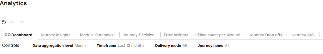
- GO Dashboard: Provides a high-level overview of your verification activities.
- Journey Insights: Focuses on journey-level performance and outcomes.
- Module Outcomes: Provides detailed insights into individual verification modules.
- Journey Decision: Focuses on final evaluation decision patterns.
- Error Insights: Helps you identify and resolve issues in your verification workflow.
- Time Spent Per Module: Lets you see the average execution time per module.
- Journey drop offs: Lets you review incomplete journeys to understand why users abandoned the process or why journeys timed out.
Adjust display controls
The Analytics dashboard features a control panel for each tab that enables you to adjust the display and timeframe for each interface. You’ll find the following controls common among tabs:- Date aggregation level
- Timeframe
- Delivery mode
- Journey name

Configurations applied to one tab in the control panel will remain consistent across all other tabs.
Change date aggregation level
Follow these steps to change how analytics data is grouped and displayed on the interface, across time periods.- Click on the Controls panel at the top of the Analytics interface and locate Date aggregation level.
- Click the drop-down arrow next to Month (or current selection) to open the aggregation options.
- (Optional) Click on the search bar to filter using keywords.
- Select your preferred aggregation level:
- Day: Groups data by day.
- Week: Groups data by week.
- Month: Groups data by month.
Change timeframe
Follow these steps to set the date range for all analytics data.- Click on the Controls panel at the top of the analytics interface and locate Timeframe.
- Click the Timeframe field to open the date range configuration options.
- Choose your date range method by selecting one of two radio button options:
- Relative date range: Use dynamic date ranges that update automatically.
- Last 30 days: Automatically sets the date range to the last 30 days.
- Absolute date range: Set fixed start and end dates.
- Configure relative date settings:
- Select the Relative date radio button to use dynamic timeframes.
- Click the Relative by list to view the available timeframe options:
- Years
- Quarters
- Months
- Weeks
- Days
- Select any of the radio buttons under the Relative by list to choose your relative timeframe. If you chose the Months timeframe for example, select any of the options:
- Previous month: Data from the month before current
- This month: Data from the current month only
- Month to date: Data from start of current month to the current day
- Next number of months: Specify how many months forward to include
- (Optional) Set the number value if you selected Last number of months or Next number of months. Enter your desired number in the input field (example; 12 for 12 months).
By default, data displays for the last 12 months. You can modify this time range as described in step 6.
- Configure exclusions using the Exclude previous list:
- Select None to include all data in the previously specified range.
- Select Months to exclude previous months from the analysis.
- Select Weeks to exclude previous weeks from the analysis.
- Select Days to exclude previous days from the analysis.
- (Optional) Select the Absolute date range radio button to set fixed dates using the date picker fields.
Filter by delivery mode
Follow these steps to filter analytics data by specific deployment environments.- Click on the Controls panel at the top of the Analytics interface and locate Delivery mode.
- Click the Delivery mode list to open the environment filtering options.
- Select delivery modes using the checkbox options:
- Select all: Choose all available delivery modes.
- PRD: Include production environment data.
- PRE: Include preview/staging environment data.
Filter by journey name
Follow these steps to filter analytics data by specific journey names.- Click on the section at the top of the Analytics interface and locate Journey name.
- Click the Journey name list to open the journey filtering options.
- (Optional) Click on the search bar to filter using keywords.
- Select journey names using the checkbox options.
Common options in Analytics tabs
You can view summary data and download the CSV files for each of the metrics in every Analytics tab.View summary data
To view summary data for each metric in the Analytics tabs, follow these steps:- Hover over any of the metric tables and then click the three dots that appear.
- Click View summary data.
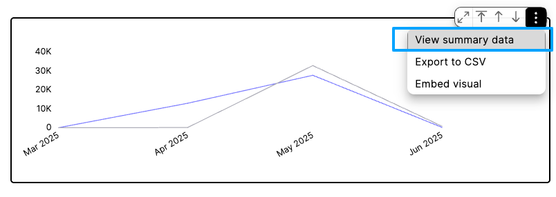

Export to CSV
To export the data from any of the Analytics tabs to a CSV file, follow these steps:- Hover over any of the metric cards and click on the three dots that appear.
- Click Export to CSV.
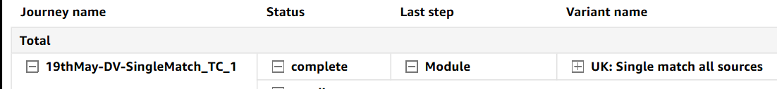
Export tables to Excel
To export the data from any of the Analytics tabs to an Excel file, follow these steps:- Hover over any of the tables and click on the three dots that appear.
- Click Export to Excel.


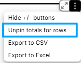
Maximizing and minimizing metric cards
To enhance the view of each metric card:- Hover over a metric card using your cursor.
- Click on the maximize icon shown in the screenshot below.
